Making of a Campaign: Multiple Gateways

The content we develop at Recurly is intended to be educational, useful, and approachable. We use campaigns to promote this content, which typically comes in the form of a digital book full of insights, knowledge, and tips for building a subscription business. As brand designers, our role is to work with the marketing team to create these campaigns—a process we’ll outline in this post from concept to production, using our latest campaign, Why Subscription Businesses Need Multiple Payment Gateways, as an example.
Start with some goals, but be brief
We’re tasked with helping our teams establish, express, and enhance whatever it is they’re trying to say. To do this, we start with a brief and a project kickoff—two exercises that help us determine what we’re trying to do and how we’ll know we’ve done it.
The project stakeholders complete the brief first. It serves as a source of truth for our work, holds the team accountable, and is referenced throughout a project to ensure that our designs are meeting the goals we originally outlined. Our brief answers questions like:
What’s our goal or objective?
What outcome do we expect?
How will we know if we’re successful?
What is the single most important thing we can say, and how should we say it?
Where will this content be used and in what formats?
Are there other considerations or requirements we should know about?
For the multiple gateways campaign, we wanted people to understand how to optimize a subscription business’ performance by using additional payment gateways. There’s an expectation that a company with our leadership and expertise communicates that kind of information in a direct, knowledgeable, and trustworthy way.
Gather requirements, ensure flexibility, meet deadlines
We hold a kickoff to review the brief and answer any questions. It’s important that anyone with a vested interest be present, because creating a campaign requires coordination from multiple teams, as well as a level of care and attention to detail. There are limits on our time and talent, so it’s critical we get the most out of our process. Sometimes, this means making minor updates so we can put resources toward other projects. Mostly, it means gathering individual expertise at the beginning of a project to avoid surprises that could later double our work.
Timing was an important consideration for the multiple gateways campaign, so we needed a simple design that leveraged our systems and guidelines. Using established layouts, elements, colors, and typography not only allows us to work quickly, it keeps us consistent. While we want the visuals for a campaign to distinguish it from others, they should also be true to our brand.

Our system is the way we talk about our work. It documents our decisions and the values that reflect what we mean when we say something “feels” like Recurly. The elements in our guidelines are proven, tested solutions with a consistent visual language. They represent what good design looks like for us.
Maintaining consistency means our design must be flexible enough to work across media. People will access this content from ads, emails, and many other campaign deliverables. Our work should easily translate to different formats.
Mood boards and the design process
Content is a natural starting point for design, but when you’re writing with visuals things don’t always translate literally. So, we use mood boards to articulate the style of a campaign. We start by finding references we like (and some we don’t). We gather them in one place and rearrange them to make new meaning. The concept for the multiple gateways campaign came from the service payment gateways provide—routing transaction information.

Lines are frequently used to represent transportation routes, trails, movement, and connection. They’re familiar and simple, abstract and expressive. We can create them quickly and easily.
Next, we look for relationships between the references we’ve collected and our existing work. A unified visual language reflects quality in our content and in our business. Disregard for the details diminishes trust. By pairing new styles with established elements from previous work, we can move forward confidently, building upon our brand incrementally.

For the multiple gateways campaign, we used patterns and layouts from “Getting on the Fast Track to Subscription Revenue” and “Seven Strategies for Subscription Success in 2019.” Arrows are a symbol we use regularly. Like lines, they’re versatile and can be especially expressive when repeated. Repetition is a reflection of stability and the recurring nature of our business.
At a certain point we must prioritize getting things done, select the direction that best expresses our message, and start designing. Deadlines are real. We’ve made the best decision we can with the resources we have, and the return on finding something better (there’s always something better) isn’t worth the value we’ll get by moving forward now. Our focus should be on the outcome we’d like to achieve and the direction that will get us there.
For the multiple gateways campaign, this meant laying out the content of the digital book with less fidelity. Stripping out visual detail allows us to first focus on how content flows through the document. Our goal is to provide guidance, so it’s important people pay attention to what we say, not just how it looks. The aesthetics of a campaign should be an extension of its objectives, so at first, we apply our visual design concept to just a page or two of the book as proof of concept. This gives the larger team something to respond to without us designing an entire book that (potentially) misses the mark.

Visuals reinforce the message
Once the team has agreed on a direction, we build out the campaign deliverables.
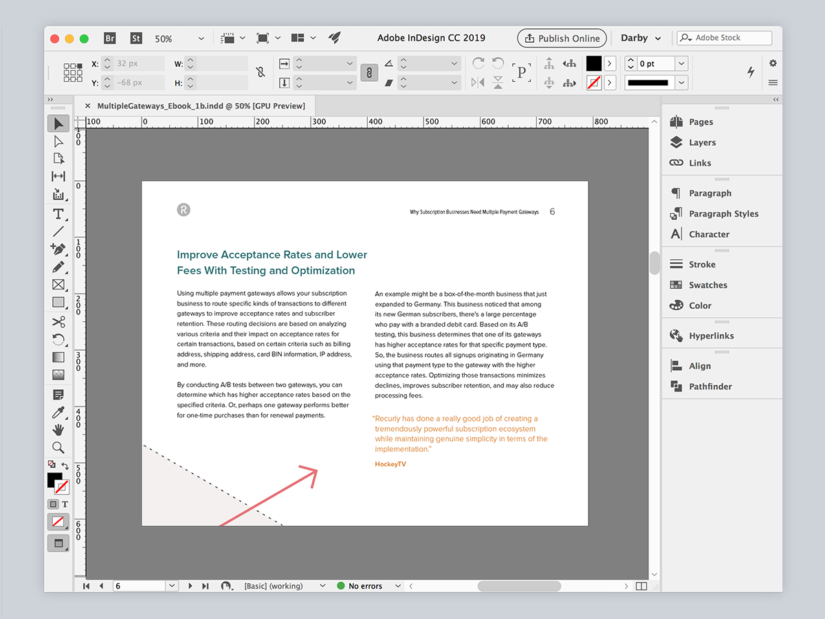
For the book, we consider how our visuals will guide people through the content to the next step. How will it look if someone opens this in a browser when it’s downloaded? Can we use illustration to simplify an idea or amplify a message? Visuals help people understand by providing context or clarity. In our multiple gateways campaign, we used arrows as a metaphor for routing transactions and looked at each spread of the book as an opportunity to reinforce that message without distracting from the content.
Subscription businesses can be complex; it’s important our designs counter that complexity by being direct and purposeful. Of course we want people to read our content, but that doesn’t mean our design needs to be special or flashy. Communication should focus on being useful, and we know there are better ways of designing than putting a lot of effort into making something look special. It doesn’t move the needle much for us.

We think critically about when a time-intensive design is the best approach and explore alternatives when it’s not. In the case of the multiple gateways campaign, it wasn’t the best option. We needed to strike a balance between strict reliance on our systems and guidelines, and creative problem-solving. To see the complete design, download the guide.


